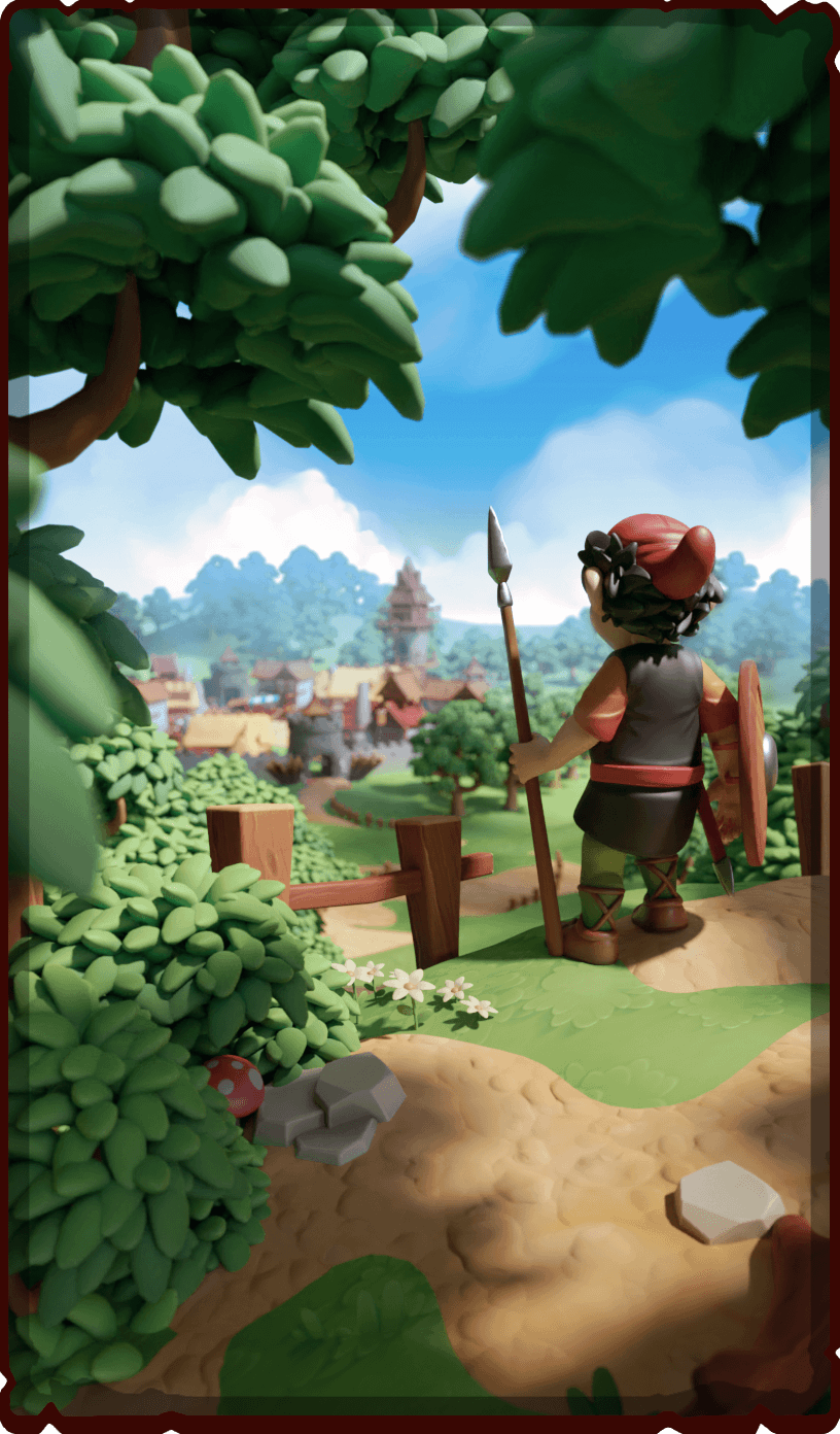
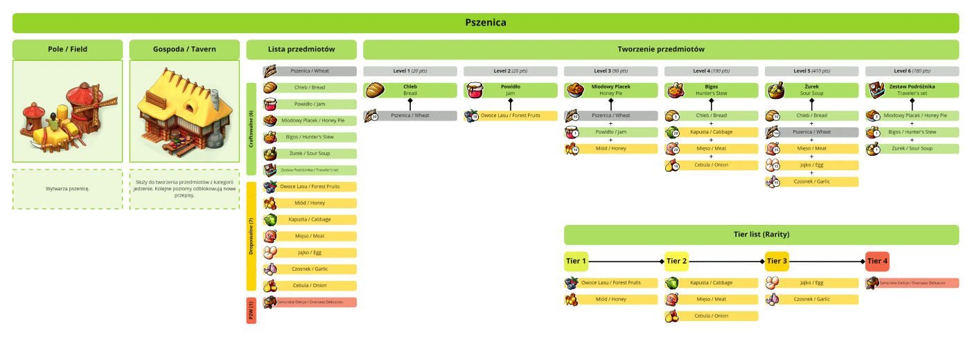
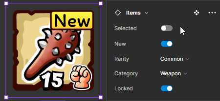
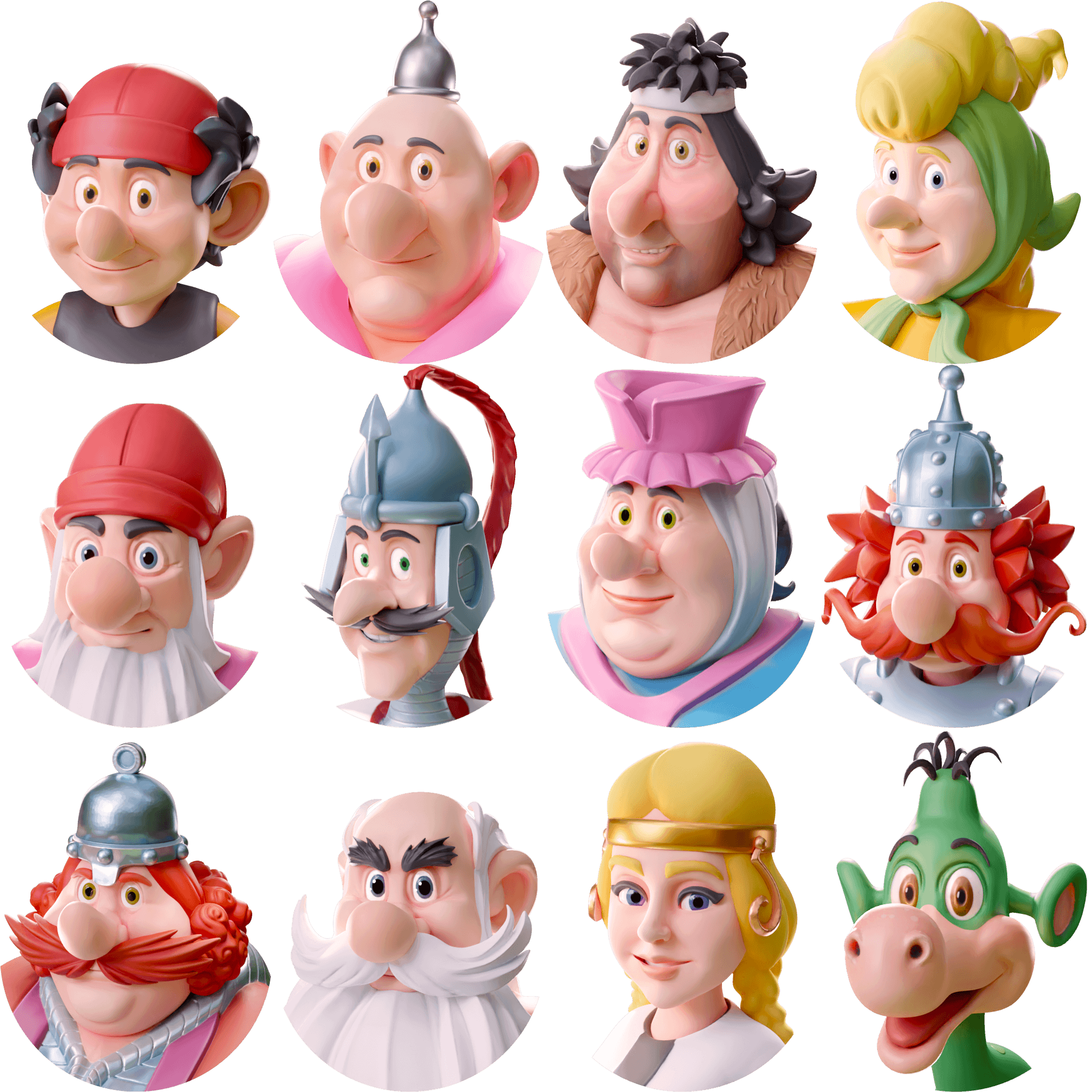
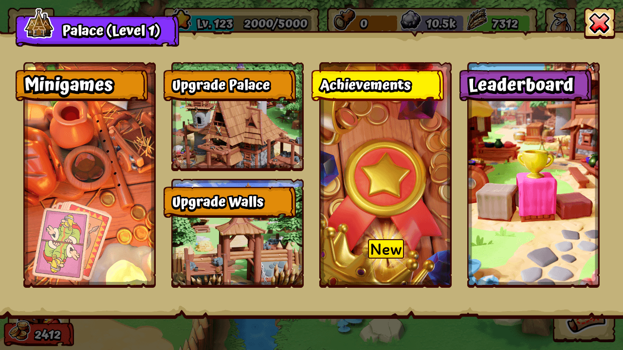
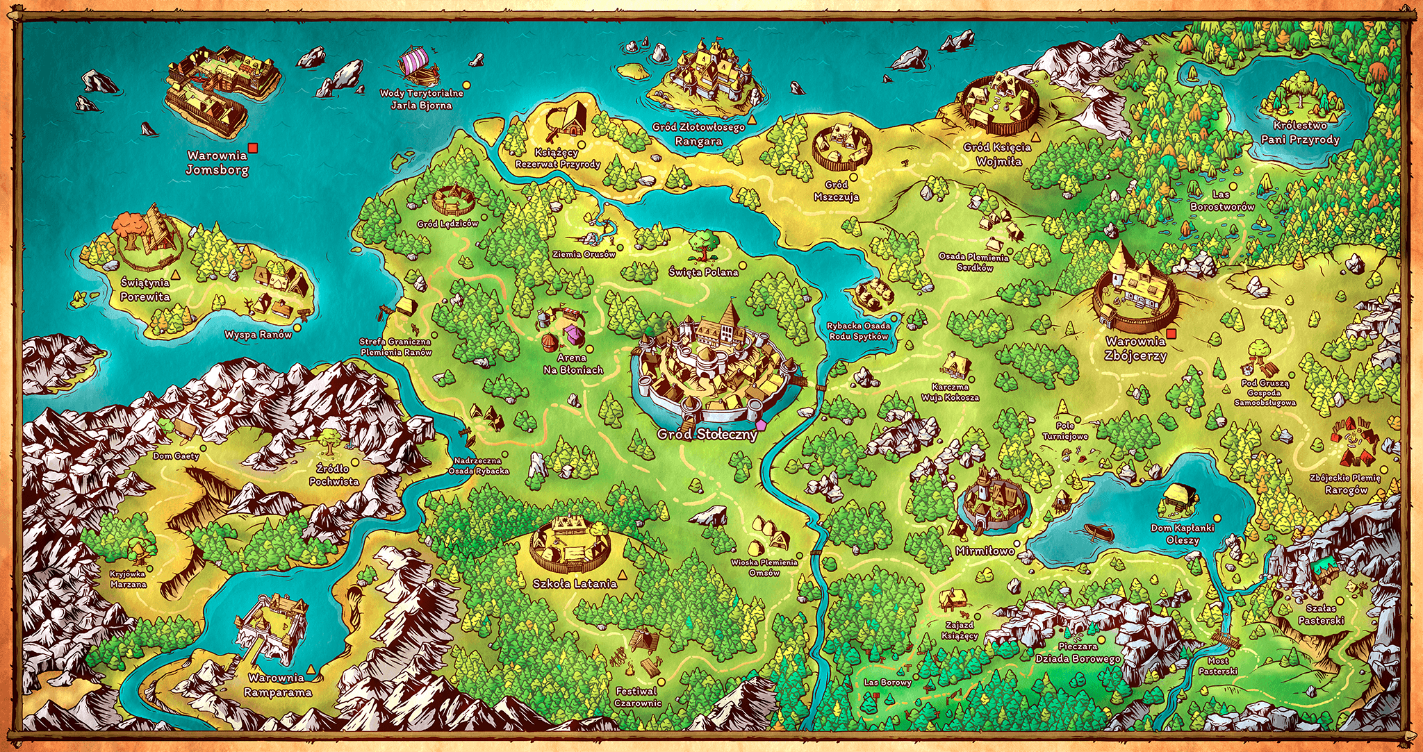
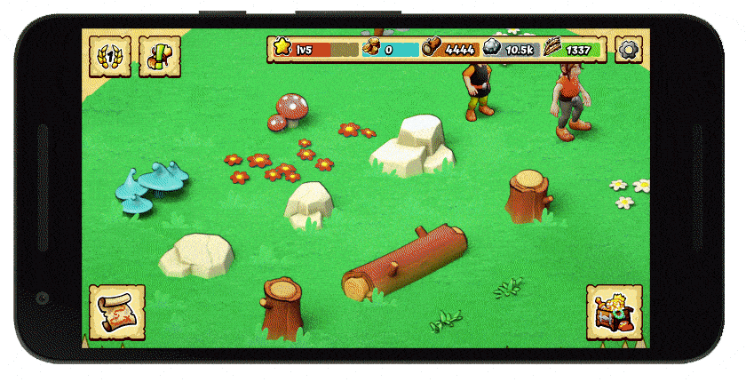
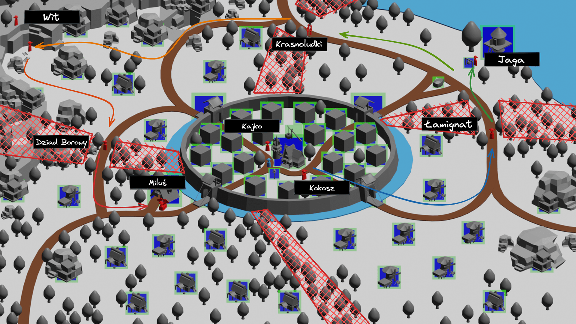
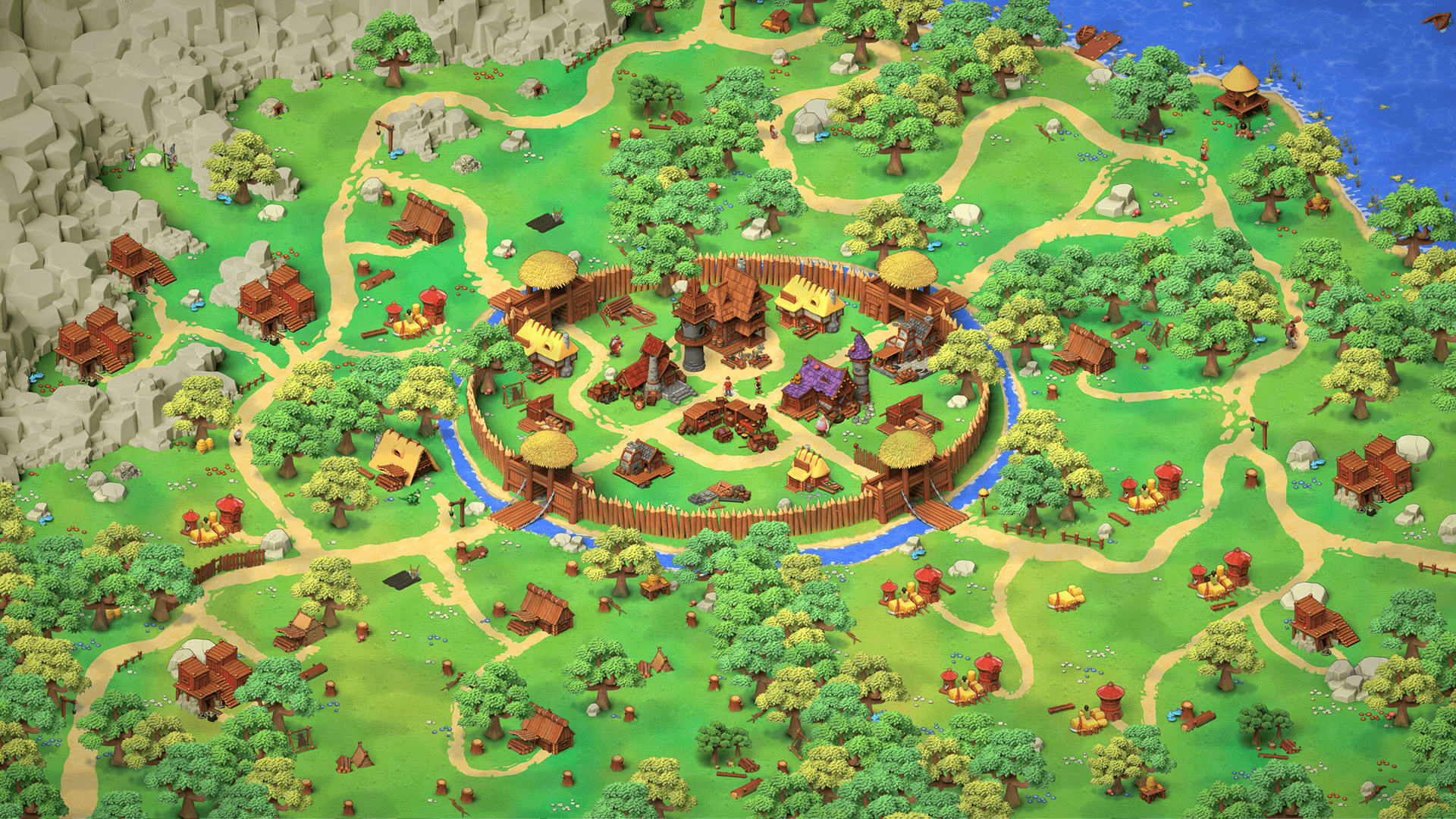
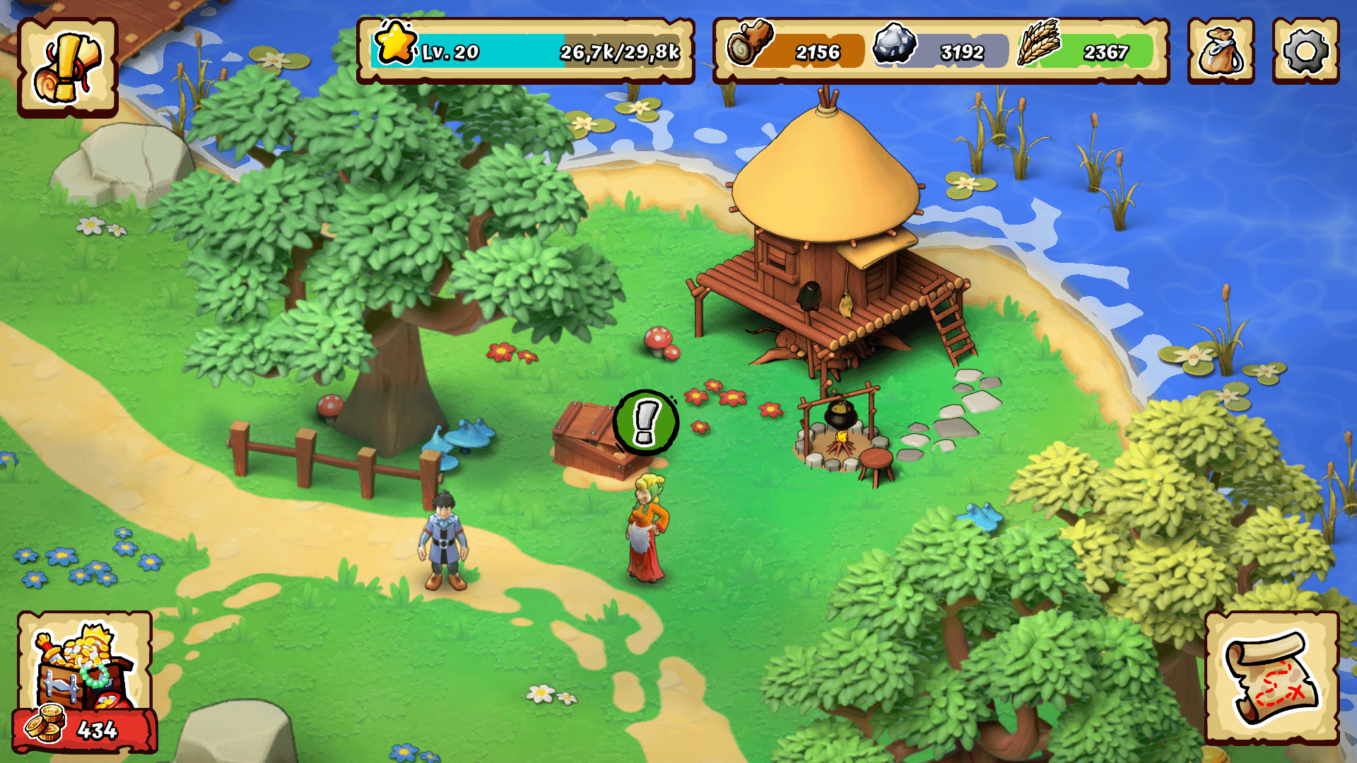
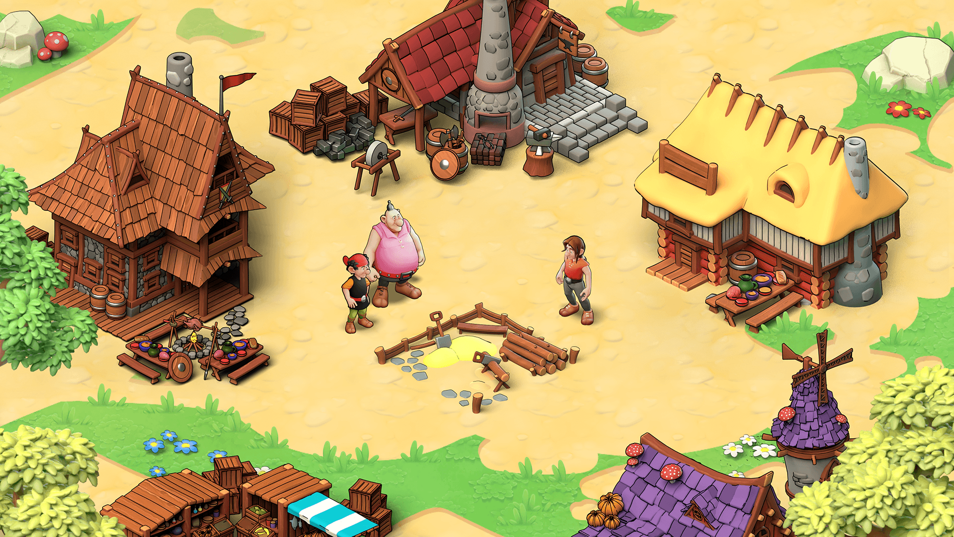
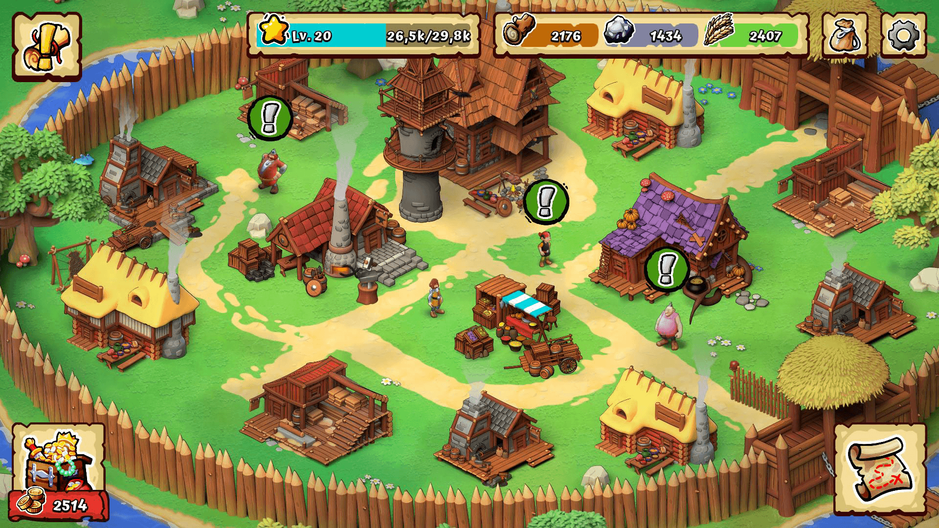
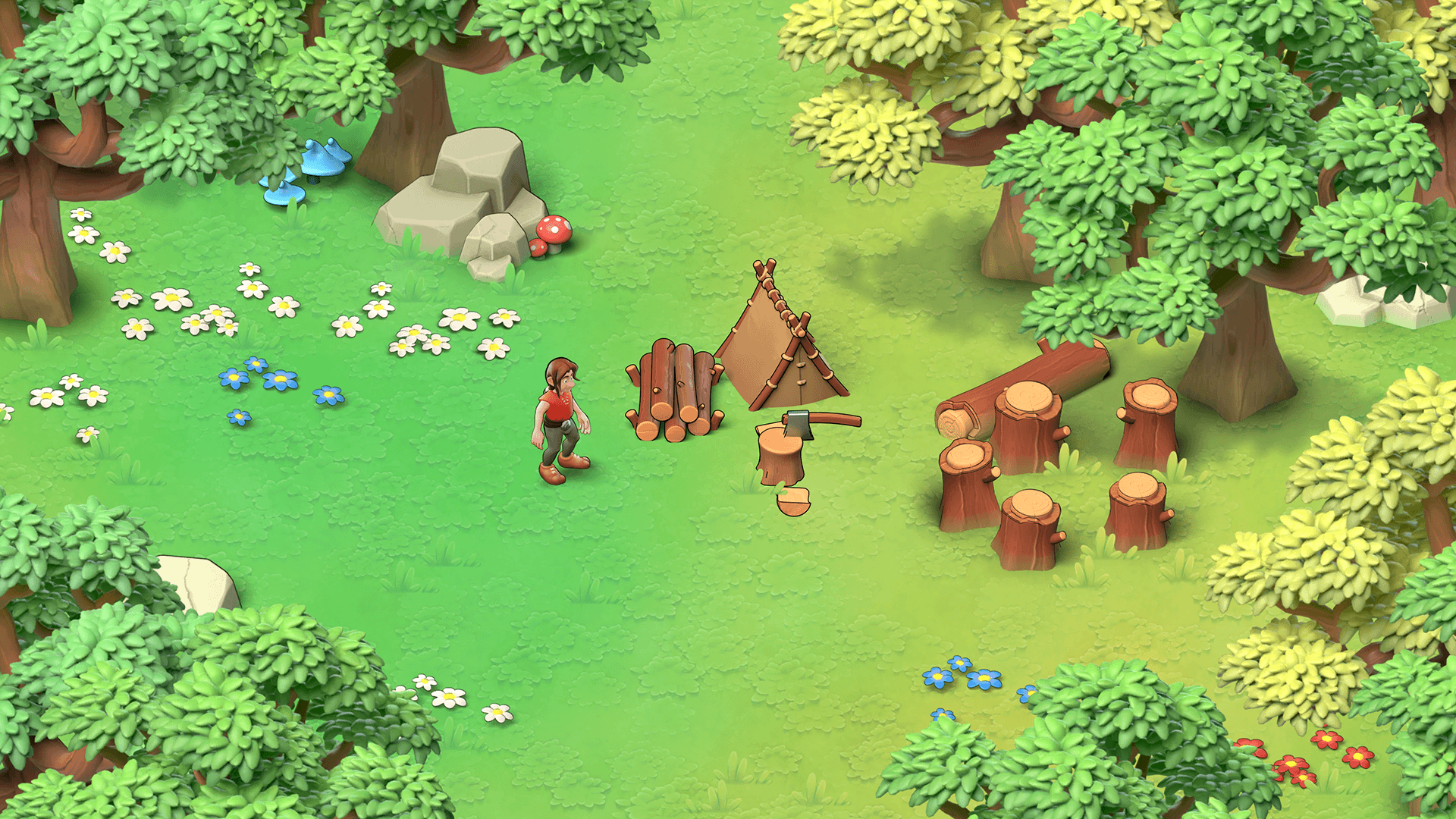
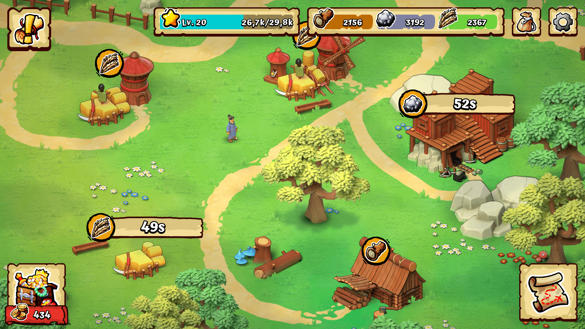
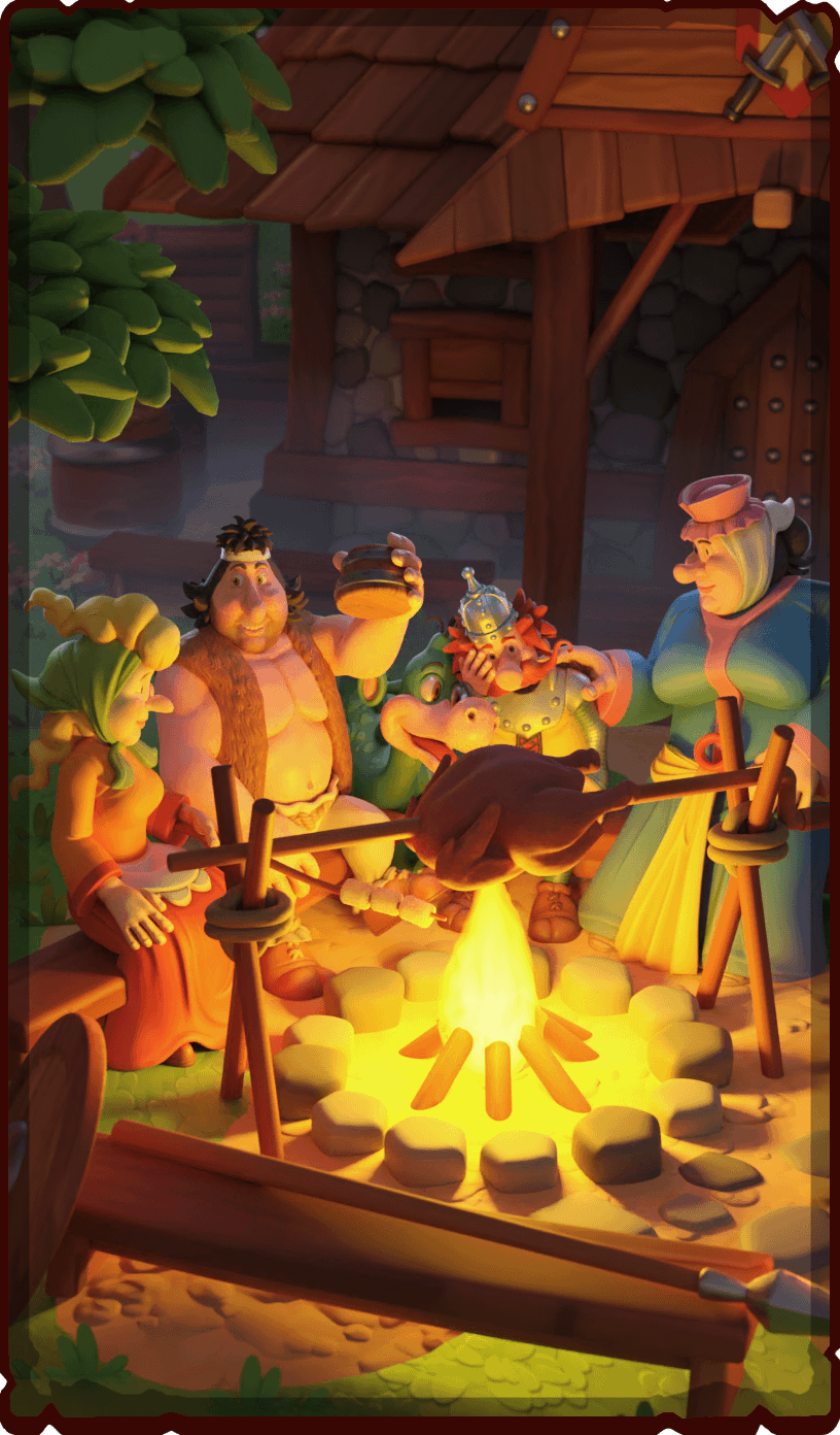
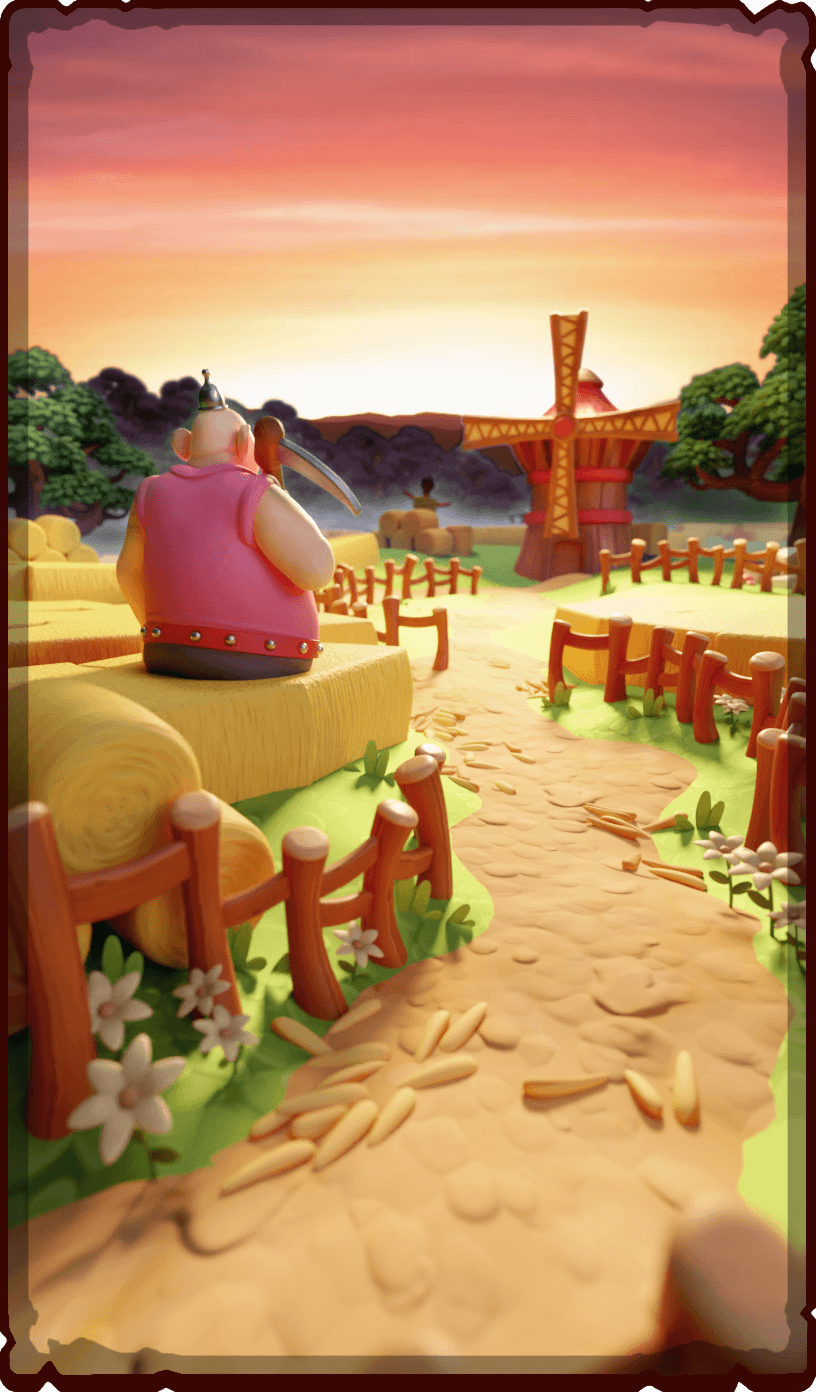
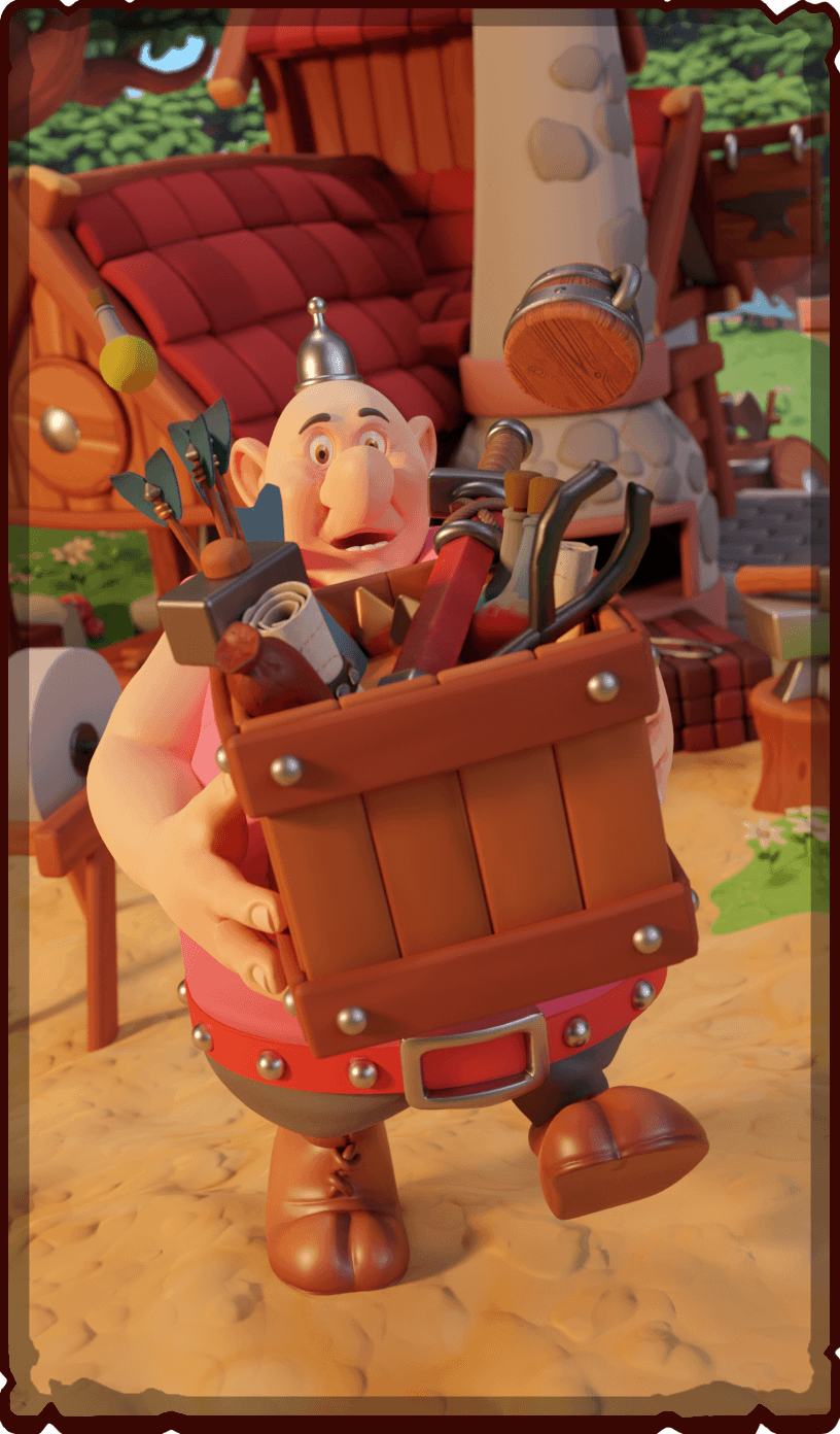
Creating a logo

The first goal was to determine the game's title, and with that, propose a version of the logo that would combine two styles, both the original comic and the newer style created for the Netflix animation. Eventually the decision was made to use the original logo from the comics and add the additional name of the game, "Build & Rule".

Kayko_Logo

Marketing

I was responsible for preparing materials for publishing the game in the store, as well as the game's landing page; creating the design and animating the background.


Game design

I supported the team with the ongoing creation of the game design document. Involving myself in discussions about theorycrafting, lore, gameplay and mechanics prototypes. I conducted research on the source material to create a reference database, which the team would then later use when creating locations, stories, items or buildings.


Interface artstyle

I was fully responsible for determining the entire art style for the interfaces, which was created alongside the art style for the game itself. The goal for this style was create interactive gameplay while being consistent with the vision of the comic.

I started the work by collecting references and establishing mood boards from which, later, the client chose the most suitable. 

The next step was to develop an art test that defined the final style, its essential elements and how to make it. Everything was documented in the central game design document to maintain smooth communication and consistency with the rest of the team.


UI Workflow

I wanted the interface to be easily editable and modular.  Anticipating a lot of changes, I wanted to have a high level of control in order to be able to make changes quickly. 

Prototypes, sample animations and UI were created in Figma. Using Photoshop to draw assets. My role was also to create tilesets, transfer them to the engine and optimize them in Unity.


UX

I started this process by creating components and determining the style, font size, styles and colours. The component system in Figma was invaluable. Thanks to it, I was able to create a whole base with different variations available for items and easily replace temporary icons with later final ones.

I researched grids and how to design them to work on other phone resolutions. As the created assets were made responsively, all the work of user experience prototyping was created from ready-made assets, not blocks or wireframes. It did not affect the speed of prototyping, and the visual effect was almost immediate, which left only later polishing.

A lot of time was spent on readability, coherent distribution between the game elements, the possibility of expanding the systems and modularity. Some aspects were prototyped in Figma, so that the developers could have an idea of how certain UI aspects should behave.


Icons

For the game itself, I designed over a hundred items divided into different categories. Some only accessible from expeditions. 

Chest armours, helmets, weapons, trinkets, and items related to food, wood and ores are the divisions we created with the team. Most of them were developed and drawn by me, as well as all icons in the UI showing various functions.


World Map

I focused a lot of attention on creating a map of the entire universe from Kayko and Kokosh, which would work for the game. The source material had no such map, so there was a good deal of freedom. 

I listed all the locations from the original comic book series and then arranged them to make as much logical sense as possible based on context.

I started by determining the aspect ratio and how much we could zoom in and out of the map. Then assumed that the capital, as the most crucial point, should be located in the centre of the map so that from every corner, we could always see it as a reference and prominent landmark. I laid out the locations methodically, with the importance of the location in the comics determined its size on the map and a difficulty level. 

I developed a design language of icons to show the difficulty and significance in the narrative of the game. For example the Knaveknights Stronghold is marked with a red symbol, while smaller expeditions such as Shepherd's Bridge are green. Another critical aspect of the map's design was continuity from the minor locations to the most difficult, largest ones. That is why many locations near Mirmilovo are mainly green.

The map was drawn in 100x70cm in case there was ever a need to print it.


Mirmilovo

We spend most of the game on the map of our iconic village of Mirmilovo. My task was to design the levels of the entire gameplay area, along with how the next quests are to proceed. In the centre, a stronghold was created, which has exits on four different sides.

In the comics, the village had several unique buildings such as the palace, Jaga's Hut and Milus's House. I put them first because I wanted to replicate them as best as possible. The map is divided into four sections, which are unlocked as the game progresses by completing the main quests. After completing such a task, we get a new companion, and another map slice to explore. Along with this, there are new gates in the village that serve as a shortcut. 

After level design I took care of level art and I meshed the entire map with rendered sprites. Later I optimize them. I also took care of the collider's pass and baked navmesh.


Animations

A particularly enjoyable process was the modelling of several assets and their animation. One of them was a box with items popping up from the ground, which later scattered on the ground for the player to collect.

I also created animations for the minigames and prototyped a lot for the UI in Figma. This helped developers translate them into the game engine with minimal effort. There were core principles that I set out:

  • Animations should help understand the feature.
  • They should be at most 1.5s.
  • Flow should be the same where the focus is needed. 
  • Micro-interactions like hover or click states should have a limit of 300ms.
  • Output animations should be shorter, so a maximum of 200ms.
  • When oscillation is added, the transition path overshoots its endpoint at least once, then reverses course to return to the endpoint.

These principles helped to create both a consistent appearance of the animation and the feeling that the player had from using the application. Good animation timings greatly reduced player dissatisfaction and helped understand some of the mechanics.


Royal Pairs

I designed three of the six minigames. The first was Royal Pairs - a memory card game. The scene shows an inn table where a game of cards was played during a break. I modelled the missing assets, retextured those that needed it, composited the whole scene and lights, prepared them on a separate channel so the candles could flicker, and finally rendered the entire thing. The cards depict the most remarkable leaders from the Kayko and Kokosh fiction.


Break-a-tree

The second minigame is chopping down a tree with our mighty Lamignat. The scene takes place in the nearby forest, and was prepared for parallax while jumping between the trees. I added a slight haze to soften the look of the scene. I prepared tree fragments as tileable sprites, which are much more saturated and have darker values, to emphasise that as a gameplay element.


Song of Power

The final mini-game I developed alongside the programmers was Song of Power, a small flute simulator. I created the whole environment and later rendered it. The final task was to make the VFX of the notes to collect.


Rendering

Towards the end of development I spent a great deal of time creating and rendering small environment scenes that served as thumbnails in the UI for individual activities, such as expeditions, mini-games or shopping in the store. All of the rendering and compositing was done in Blender using Cycles.