Improved logo & custom icon
My first task was to recreate an existing logo design. My goal was to improve its visibility and make it compatible with dark and light mode options. I created a new crown from scratch because the old one was drawn and I decided to keep everything in vectors. To complement this, new icons were designed for the launcher, Discord server and website favicon.
LAUNCHER
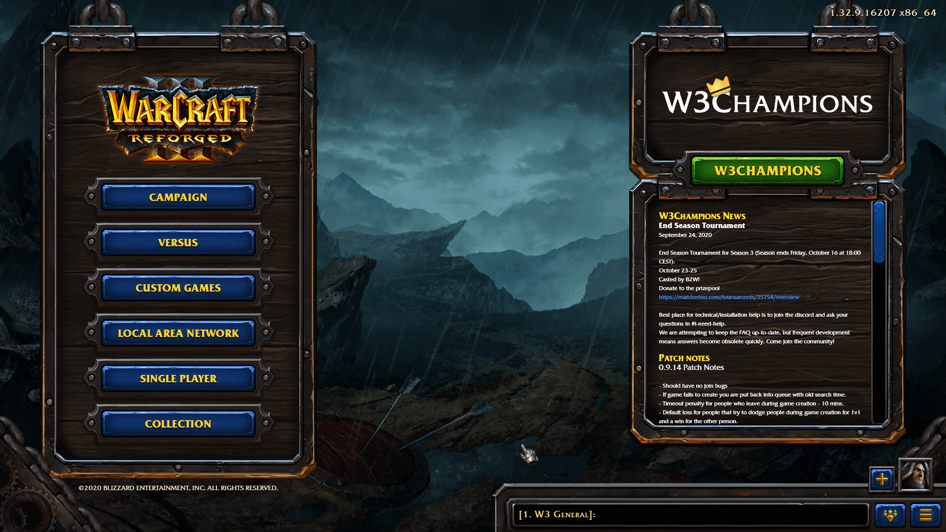
The entire launcher has been designed from scratch to give players easy access to the W3Champions platform and updates. On the main page we included News and Patch notes, so people won't miss frequent updates and events. There is an option to hide this.
The most difficult challenge was to create the Hotkeys tab. I started by counting all components and the grouping needed to find a layout that will work. I prepared the missing icons for the Inventory and Neutral functions in the navigation menu. After that, I set up all of the grids, text and icons. To support new players even further, we added the ability to switch between two different styles of icons (Classic and Reforged).
On the Settings tab, I redesigned the directory, colours and bottom menu button options. The tab is designed to support additions to this page with a scrollbar if required.
AI Icons upscale
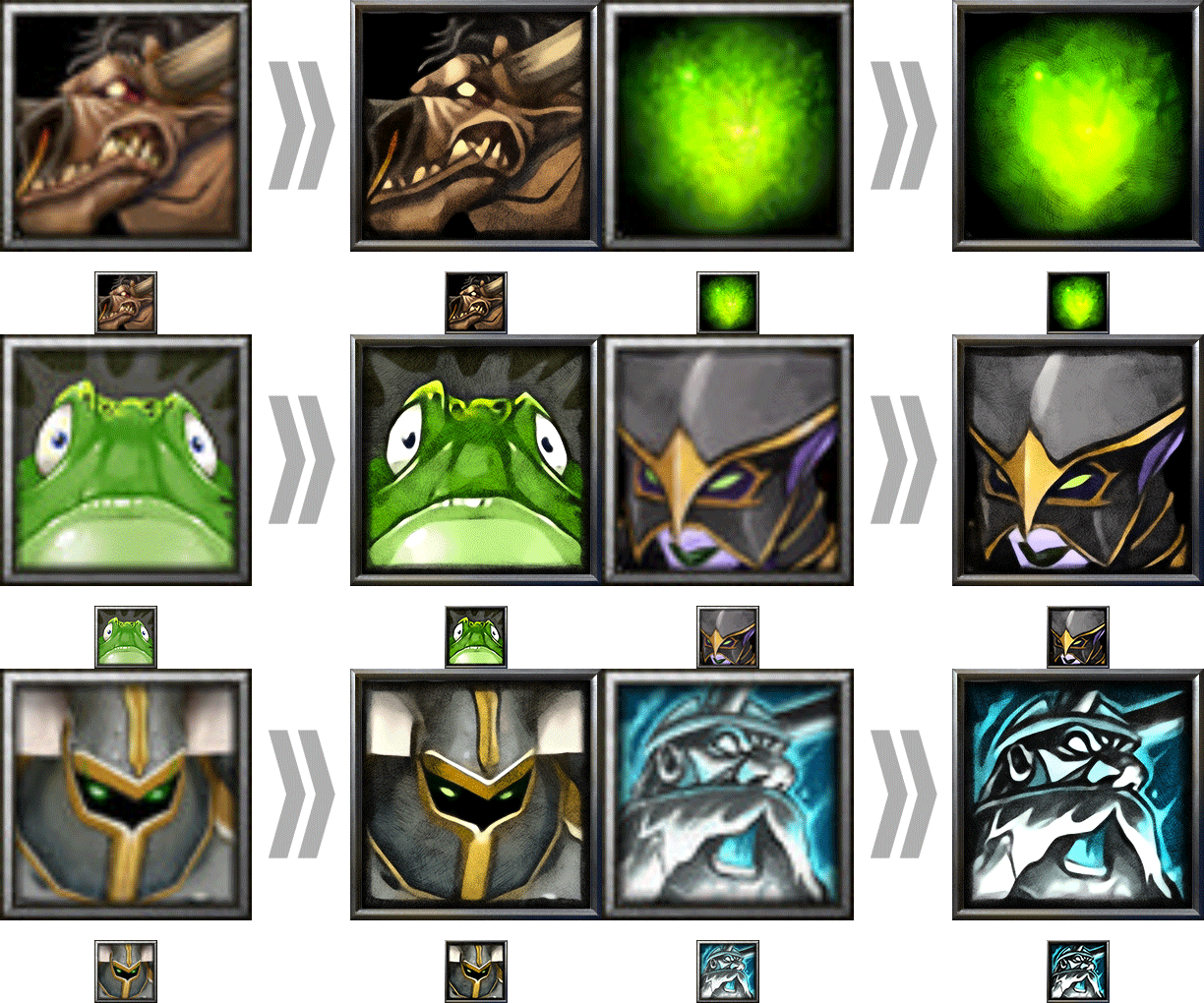
A big part of the community was nostalgica for an old style of portraits as rewards and wanted to be able to choose between the two design styles (Reforged and Classic). There are about 1100 portraits and all of them are 64x64px. To make them compatible with the new ones, I had to find a way to increase their resolution to 256x256px.
After some research, I found a way to scale the icons with deep learning. I tested several pre-trained models and used an algorithm that provides the best quality for this type of images. Once all of the icons were automatically upscaled, they still were not at a high enough quality and overpainting them would take months, therefore I took a sample image and created an automated script to improve the levels, colours and create a sketch effect which can then be re-applied on top of the original image. This adds a little bit of depth and removes the smoothness of AI. The last task was to design a new frame.
Once everything was in place I ran the whole automated process for roughly 16 hours, you can see some examples of this process below.
Loading Screen
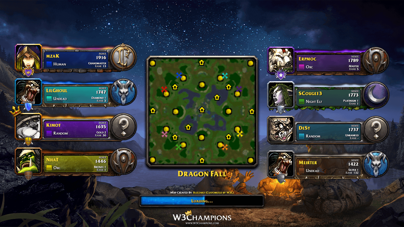
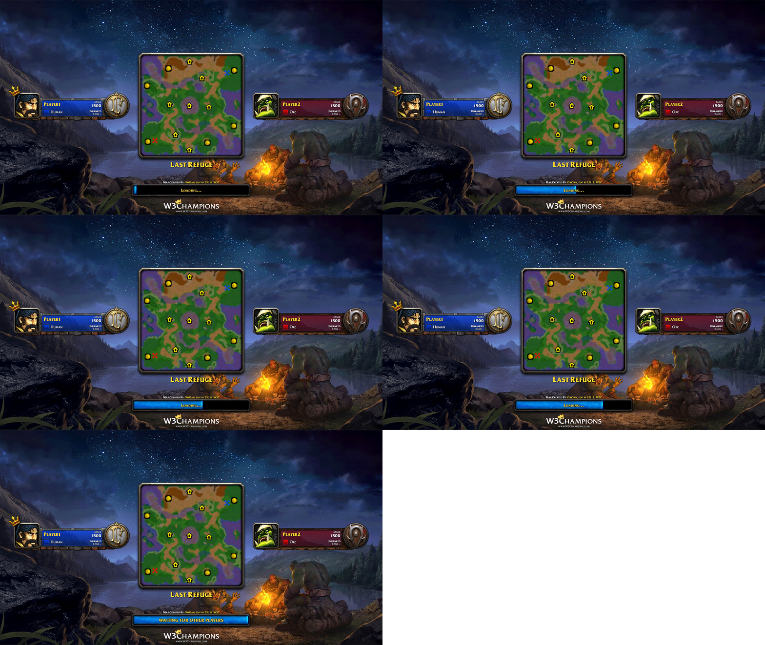
The original loading screen provided insufficient information. I took this opportunity to improve the information displayed and replace the default background with a more interesting and cosy look.
Using parts of existing in-game UI, I modified and designed frames for the five race selections: "Human", "Orc", "Undead", "Night Elf" and Random. Next, I worked on the typography to show more relevant information from the W3Champions ladder, such as player name, MMR, Division, rank and race selected. Behind all of the text, I added a gradient background that indicates the player's in-game colour. For all ladder divisions(Bronze, Silver, Gold, Platinium, Diamon, Master, Grandmaster), I created coloured frames with space for a division-specific crest and highlights between the player's portrait and race icon. The screen for the 4vs4 game mode is designed to show the highest MMR player at the top, so we decided to add a small crown indicator which helps quickly identify which team you are on, and who your allies are.
The crown indicator and backgrounds are options which can be changed by players, allowing future designs to be easily implemented.
Game Overlay
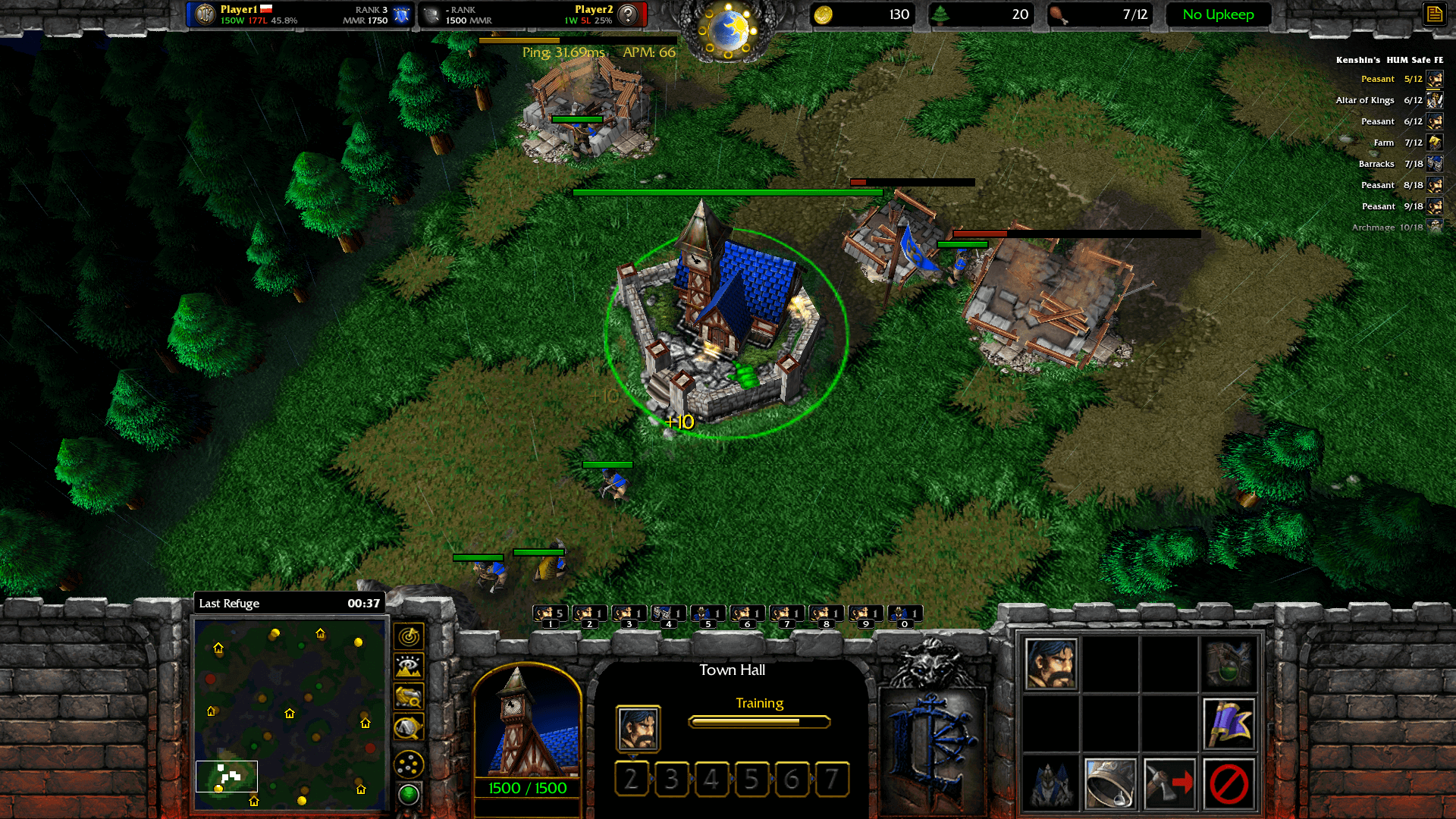
A community developer named Pad created a streaming extension called W3Booster. I took the opportunity to redesign it to give it a more minimalistic look. The overlay is used by streamers in-game to show player and opponent stats, map name and other useful game-specific data. I added a game clock, a green icon near the minimap which shows whether the inventory script is active. Another idea was to add a useful feature for new players: give them an instruction list to learn build-orders, which automatically live updates once the task is done and goes to the next one. The build orders would be community sourced and updated via the website.
Minimap
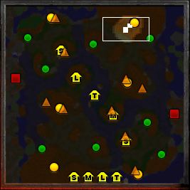
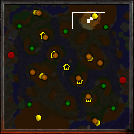
The in-game minimap has a readability problem when playing new or large maps. I created icons with different shapes and more saturated colours. There is an icon for all of the neutral buildings, to solve this problem I recreated the current icon, but for each building, I added the most suitable letter. (S - Goblin Merchant, M - Mercenary Camp, L - Goblin Laboratory, T - Tavern) All these changes are intended to help distinguish the elements at first glance.
Goldmine worker count
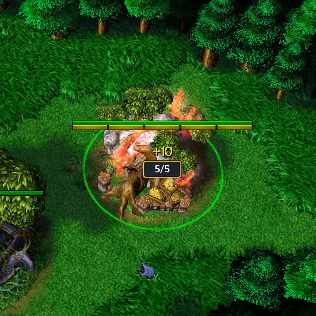
Another quality of life change to help new players was to add a common RTS feature which displays the worker count on goldmines. For two of the factions, this is already a supported feature due to the nature of their workers. New players to the other two factions often have problems with knowing if they have the correct number of workers.
Chat & Friends
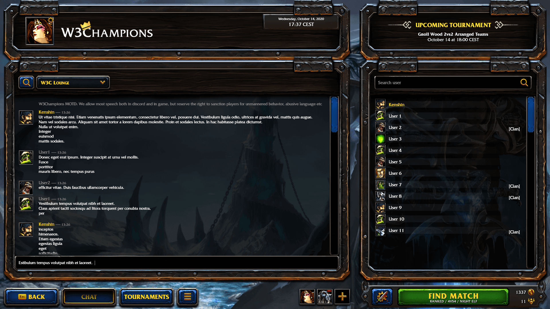
After loading the assets, a completely new menu will appear. The user is greeted with a chat box and a list of logged-in users on a given chat room. You can easily change the chat room or create a new one from the dropdown menu. To access the friends list you can press the add-to-team button at the bottom, near the Versus button and the user list will change to your friends list.
In the top right corner, you will find information about upcoming tournaments and important messages from the platform admins.
Versus
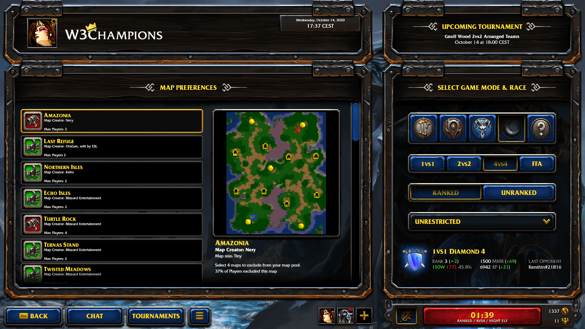
Near the Find Match button, you can access the Versus menu to change your race, game mode and map settings. You will find here your recent statistics to the selected race and game mode. I created an animated button which displays while searching for a match. We added your queued time and information about the searching game, so you still can see it while in other menus.
To the right of the search button, there are icons that show how many players are on the server and how many people are in the queue. While hovering on them, you will get more information about various game modes and region details, including how many players are queuing for a match.
Post Game
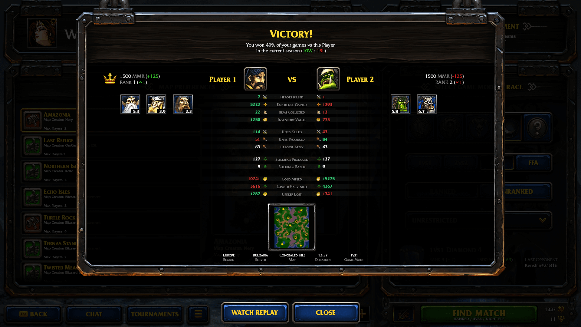
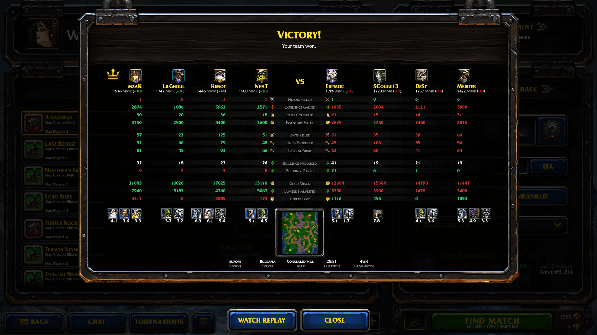
I designed a new scoreboard that is consistent with the match summary a player will get on the website. All of the information is in one place compared to the original design which required you to click on separate tabs. It does provide additional useful information from W3Champions such as, how many times you faced a specific exact player in this season.
There was some additional challenge to design the scoreboard to work in all game modes: 1vs1, 2vs2, 4vs4 and Free-For-All.
Promotion
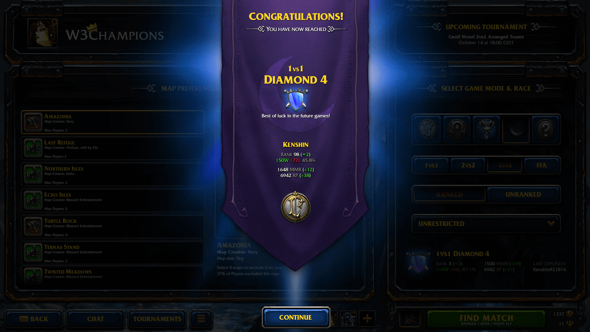
When players on the ladder perform well, they will be promoted to a higher division, I designed a promotion screen which appears after a match which would take you to the next division. This is designed to give players a feeling of progression and reward. This is a key visual feature seen by all players immediately on a seasonal reset when you have to play 5 placement matches to be assigned a division.
The screen contains information useful to the player to see how well they have performed.
Player profile
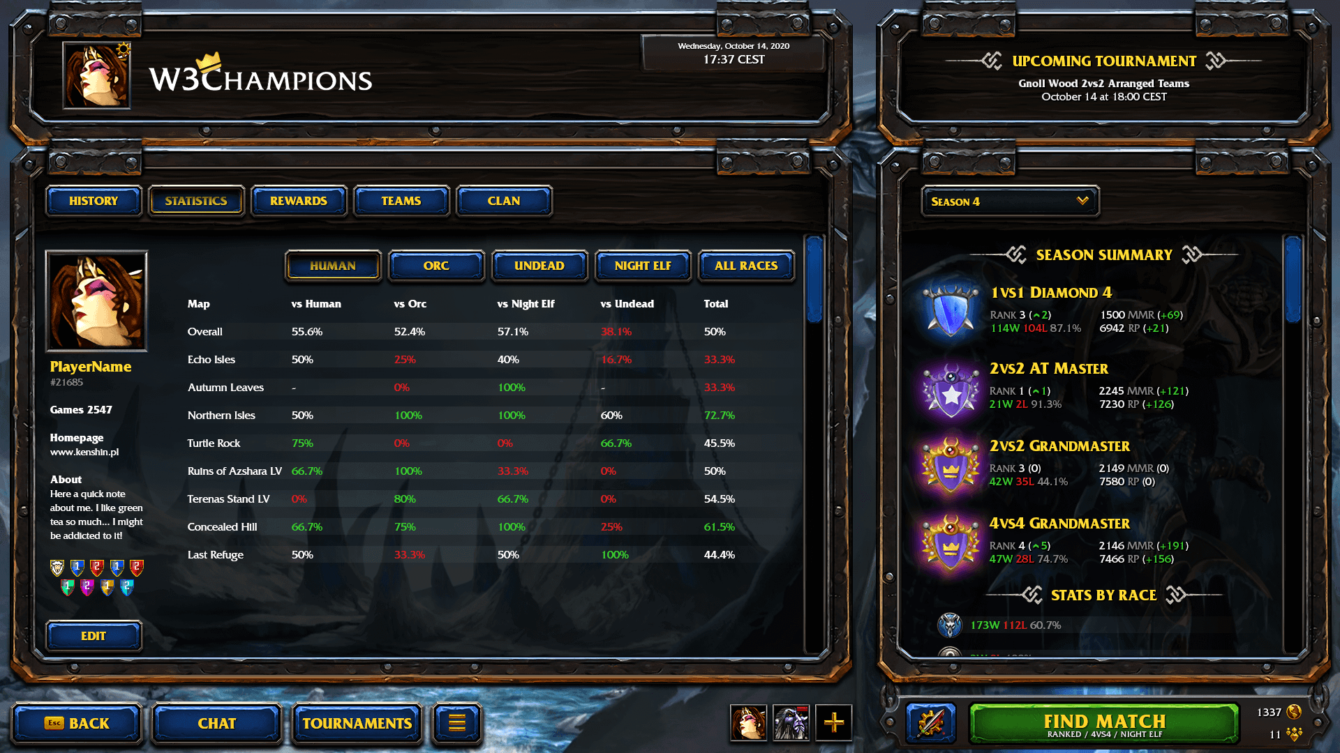
By clicking your portrait in the top left corner you can access your profile. Here you can edit your bio, badges you collected and see your recent match history. There are other tabs which can give you access to rewards, teams, clan (groups of players) and your statistics. All of this can be found on the website as well.
Rewards
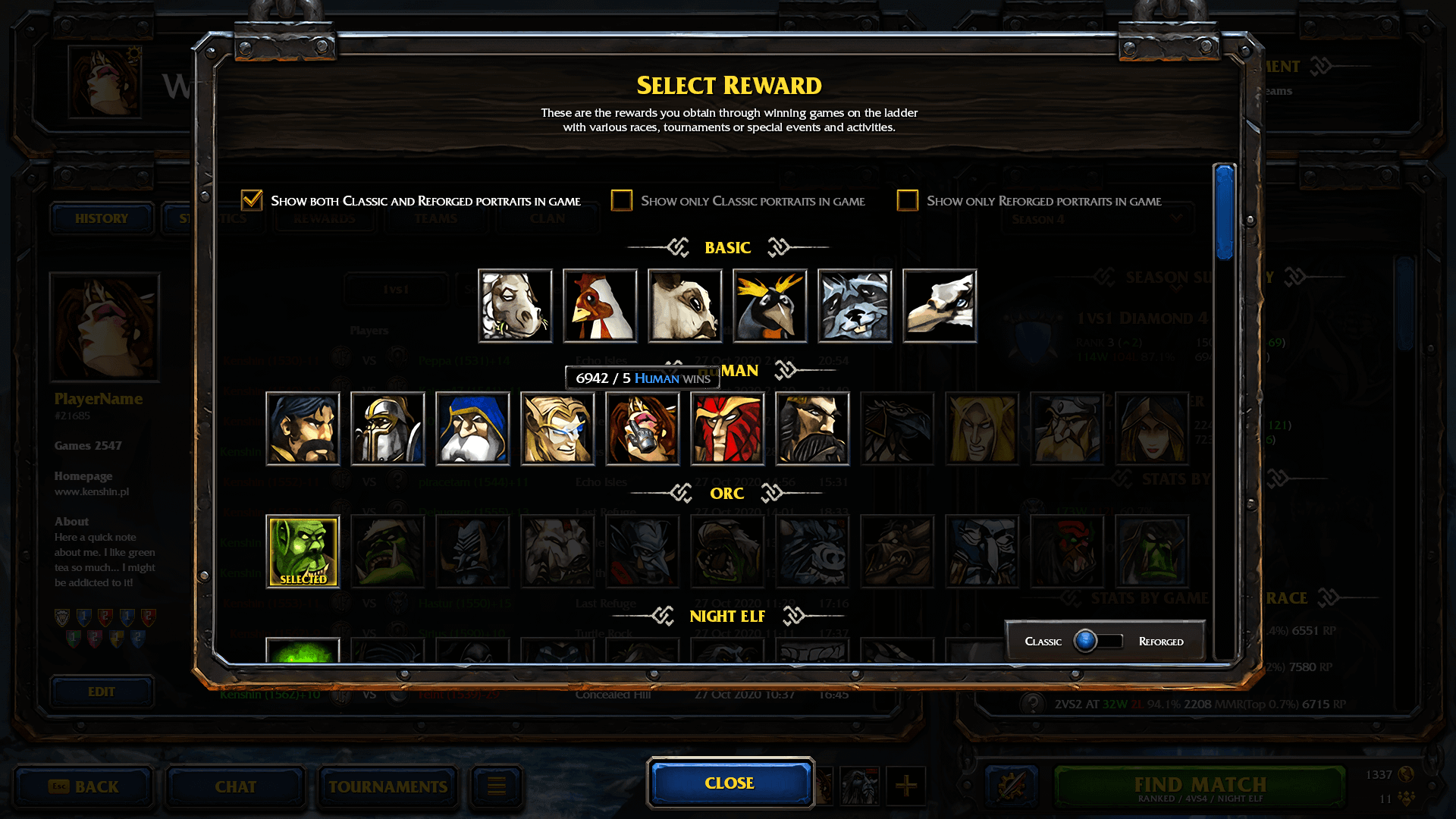
Players can unlock rewards by playing more games and completing achievements. On the website, they can select unlocked profile portraits, but as we found that a lot of people didn't know of this feature, we decided to create an in-game tab, which encourages players to collect all rewards and easily select them at any time.
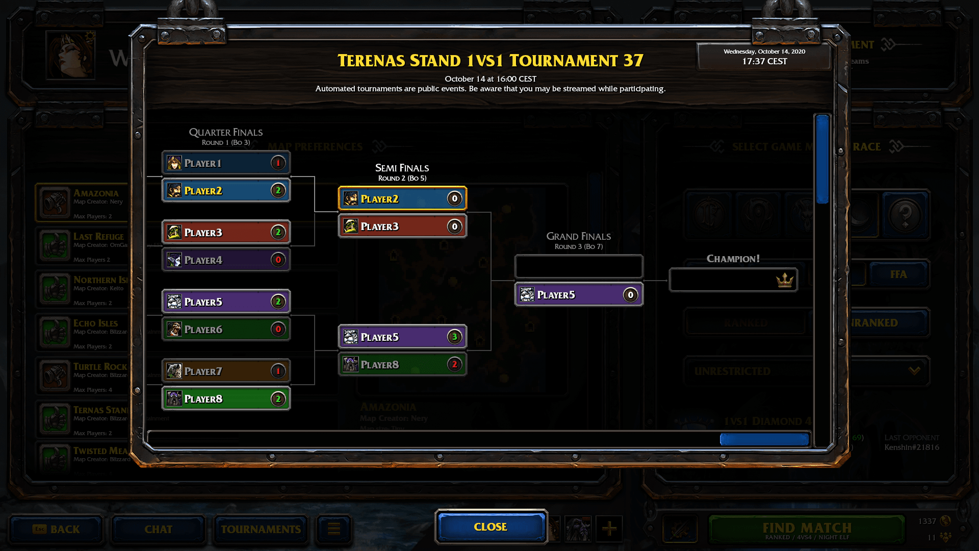
Tournaments & Events
I designed a menu for admins to create tournaments and events. This helps with hosting games and keeping track of the tournament brackets. Players can easily sign up or be invited to tournaments. The system helps players in choosing the maps to be played. All players can see in-game details about tournaments and observe games or download replays.
We recreated and improved the old automated tournaments.


